
The view on the other side of the nursery. I thought long and hard about the furniture in this room. Let's face it, there is a lot of ugly baby furniture out there. And the fabulous stuff that is way out of our price range. And the cribs are so huge.
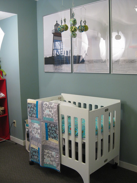
So I worried about it for a while and decided to by an oh so modern mini-crib. It is the perfect size for our littler space and can be pulled out of the room and put in our room at the beginning. I was worried that it would look cheap or be too small for the babe at some point. But for now, it's the perfect size for tiny baby and I adore it in this room.
The photo above is an original farmkid print by my husband of my home-town lighthouse. And some kids jumping off the end. (Really adults, but all kids at heart). It is blown up and printed on plain paper, which gives it a lovely grainy edge. And I made some fuzzy balls for a mobile with leftover flannel scraps.
This room is the baby's room, but it was never designed for baby. When we did carpet and paint last year, I knew there was a possible new resident sometime down the line, but chose 'grown-up' colors anyway. And I wasn't going to repaint if this little bean was a girl. I think it helps the room stay away from some nursery standards that I wouldn't want in my house - themes, pastels and general fuzziness. I wanted bright and colorful, with a hint of the collected (sound familiar?). It's harder for me to pull together a room in a short time, because I like to collect the furniture and decor as I go. So the room is a little empty now, but I'm guessing this kid will collect a few things along the way.
Gosh, Marie, it's just gorgeous! Could I live there, please? I'll take good care of the baby, promise.
ReplyDeleteYour nursery looks lovely! What a lucky little "bean".
ReplyDeleteI love it! I love that nurseries can be modern and sophisticated, but still feel youthful. Nice job! (Not that I expected anything less, of course.)
ReplyDeleteLooks great Marie!
ReplyDelete